When I was in Rite Aid a few weeks ago, I picked up the Wet n Wild Sweet As Candy Color Icon trio. I bought this particular one because it seemed like a great palette for a pretty, but brainless look. Sometimes, I just don't want to have to think about colors and would just like to throw some pretty colors on and call it good. The pink in this palette is really what did it for me, though.
I can't say much on wear, because I haven't used these shadows yet. They applied nicely for the swatches.

Swatches over Too Faced Shadow Insurance, photos in natural light.
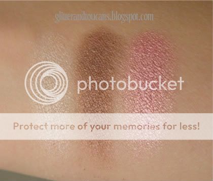

The pink is so pretty! I'm quickly becoming obsessed with pinks these days.
What do you think?


4 comments:
I love the look of that brown! Does it have a pink sheen or are my eyes deceiving me?
The pink shade is lovely!
SilhouetteScreams: I don't believe the brown has a pink sheen, at least not that I'm seeing. It is pretty nonetheless :)
Lillian: I'm definitely loving the pink in this trio!
I like the bottom swatches best. The brown in the top swatch has red in it, which will make your eyes look sore. The brown in the bottom has some taupe in it, which is much better. The pink in the top swatch also has some orange in it while the pink in the bottom swatch has more rose, a better choice.
Post a Comment